
Designers showcase the art of print design at Vox Populi gallery.
Penmanship is defined as the art of handwriting and in the digital age, it’s considered a dying art.
Recently, elementary schools have been cutting handwriting and penmanship classes from its curriculums. While penmanship may not be important to school boards anymore, the art is still crucial to graphic designers.
Penmanship is also the focus for three local graphic designers who came up with the idea for their exhibition for Design Week. Curators, Dan Gneiding, Elysse Ricci and Mikey Burton collaborated with 30 local designers to showcase penmanship and how they interpret it at Vox Populi Gallery.
Once they decided on Penmanship, they began contacting other designers with a vague description of their idea and let the designers use their creativity to design their own posters. A quote from Philip Dormer Stanhope was the only direction the designers were given: “A man’s penmanship is an unfailing index of his character, more and mental, and a criterion by which to judge his peculiarities of taste and sentiments.”
“We came up with this concept of penmanship and that it’s becoming a lost art with everyone typing instead of writing,” said Dan Gneiding, a senior graphic designer at Urban Outfitters who also writes his own blog, Grayhood.com. “I know in grade school we had a penmanship class and it was graded the same as math or science. I don’t think that’s really done anymore, so we gave everyone a brief description of something penmanship related and let them run with it and do whatever they wanted in their own style.”
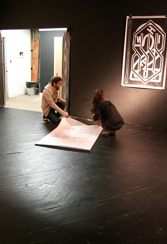
Held at Vox Populi Gallery, which opened in 1988 and is one of the country’s oldest artist run galleries, the designers were given a black room to fill. The black walls helped the three designers come up with their final decision.
“The space itself was an inspiration for them because it’s a black box so they were like, ‘what can we do?’ because it’s not a traditional gallery space, it’s a black box,” Andrew Suggs, executive director of Vox Populi Gallery, said. “So that was cool working with them. It’s a unique space and they really approached it that way.”
Only using black and white, each designer created a poster centered around what penmanship means to and how their penmanship represents their character. Some used their own handwriting and scanned it into the computer and digitally manipulated it. Other posters were designed only with a computer, and every poster was different from the ones that hung beside it. Most of them were based solely on typographical elements while a few others used images to show their penmanship. Although every poster was individually unique to its designer, as a whole, the exhibition had a unifying flow to it.
“So my inspiration was my own handwriting, my own penmanship. It’s really important to my work because when I plan typography pieces I sketch them in my own handwriting. It was natural for me,” Ricci, a catalogue designer at Anthroplogie said. “The reason I went with what I went with was because in 1999 I changed my handwriting. I made this decision that my handwriting is going to be different and it was around the same time I was getting really serious about art.”
A graphics designer for Antrhoplogie and 2009 alumna of Tyler School of Art, Danielle Kroll was asked to participate in the exhibition by her co-worker, Ricci. Her inspiration came from her inner desire to gain retribution from her fourth grade teacher.
“Through first and third grade I got really good grades in handwriting and then in fourth grade I got a C, and it really upset me and always stuck with me. So it’s funny because I’m a type designer now and my teacher gave me a bad grade,” Kroll said.
Kroll’s poster featured very ornate type that read “My fourth grade teacher didn’t like my handwriting.”
As the beer flowed and the music drifted throughout the gallery, more and more people arrived for the opening reception of Penmanship. Many of the featured designers were there to examine their completed work. Many of them had friends and family in attendance for support.
This was the case for Ryan Katrina, design director for Neiman Group and a member of neuarmy.com. Katrina said his daughter is missing out on the chance to learn handwriting in school.
“My daughter is here with me, she’s six and she’s into writing and it’s sad they don’t teach cursive in school anymore,” Katrina said. “It kind of made me mad.”
“So I’ll take it upon myself to teach her cursive on my own – kids are not going to learn cursive in schools anymore,” Katrina added.
Penmanship is about bringing older techniques together with newer technologies. But it was also about bringing together a community of local designers for a purely artistic purpose. The event proved Design Week’s mission statement that through collaboration and unique vision, designers can produce something beautiful for the public to admire. The gallery will continue showcasing its designers and their work until Oct. 23.
“Philly is not a city to live in and be a designer because there are only a couple places that are valid to work at,” Ricci said. “So it’s tough, but it’s also awesome because there’s such a tight community.”
Stephen Rose can be reached at stephen.m.rose@temple.edu.

Be the first to comment