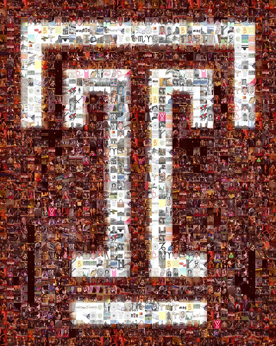
What if the Temple ‘T’ did not exist?
None of the shirts, hats, mugs, magnets, notebooks, flags, jerseys or key chains would be adorned with that single significant letter. They would be blank and ordinary things, no different from what could be found anywhere else.
Cars would drive down North Broad Street without ever knowing that they are in Owl Country. There would be no giant ‘T’ on Wachman Hall, shining like the North Star of Philadelphia and guiding students back to where they call home. The ‘T’ is a symbol that most students probably would not miss until it was gone.
In celebration of its 25th birthday this month, many students seem thankful of the emblem created from a graduate student seminar project at Tyler School of Art in 1983.
“I wouldn’t be able to identify with other Temple students,” sophomore biology major Soumi Rajan said. “It wouldn’t make Temple different from any other school.”
Sophomore chemistry major Sindhu John said he associates the ‘T’ with Philadelphia and Temple.
“I think of my experience,” John said. “Without it, it’s not there to remind you.”
Junior business major Lindsay Cantave said she can’t imagine any other symbol representing the university.
In 1983, Former President Peter Liacouras had set out on changing the school’s identity. Professor Joseph Scorsone supervised the students who participated, as the head of the MFA Design Program. The main project was to create a design for Temple that could be easily reproduced. Scorsone explained that a new seal was necessary because schools were starting to promote themselves on television and in newspapers.
“The symbol had to be visually strong,” Scorsone said.
Scorsone and the students worked closely with Liacouras through a series of meetings. Each student came up with a design and the group narrowed it down to three selections they presented to the president and the Board.
Kris Herrick, a Tyler graduate student that participated in the project, said two of the three selected were her designs.
“I really love corporate identity,” said Herrick, who graduated in 1983 and is now an associate professor and coordinator of the graphic design program at the College of Saint Rose in Albany, New York.
When the group presented, Liacouras decided that he favored one design, while the Board of Trustees liked another. Then, through newspaper polls and other forums, Liacouras called on the students to vote on the design. The ‘T’ displayed throughout campus today won the popular vote in 1983. However, it was not Liacouras’ first choice.
“Then someone told me it was Greek,” he said. “And I said, ‘I like it.’”
Herrick explained that at first, the new emblem for the university was not totally embraced by everyone. She said that some still preferred the traditional symbol: the State House with a Latin seal.
“I didn’t know if this would work,” Herrick said. “I just hoped it would.”
Liacouras admitted that there was some difficulty in getting all of the schools, colleges and departments to accept the new ‘T’ once it was finalized. However, he had an effective response for those who refused to accept it.
“We just cut their funding,” he said. “For stationery, business cards, things like that.”
Although Herrick agreed that change can be hard to accept, she thinks that the symbol has gained a liking from the Temple family.
“It’s earned its way,” she said. “It’s worked in the media, on campus and it’s worked in the hearts of Temple. That’s what made it last.”
Scorsone also agreed that the final choice was the best one. He said that the ‘T’ was appropriate, as the university has always been dubbed just “Temple.”
“It works on anything from a basketball jersey to a letterhead,” he said.
Looking back, Herrick hoped that the design would be a mark that could unify the university. She mentioned that she particularly liked the display of the Temple ‘T’ on the manhole covers on campus.
The ‘T’ has indeed become a very effective and notable symbol throughout the campus and Philadelphia. Scorsone said he stands behind the symbol, and that it does its job – especially due to its incredible recognition factor.
“It’s bold, bright, upbeat and collegiate,” Herrick said.
That was a major feature of the new symbol: its novelty.
“It’s simple, but unique,” Liacouras said. “It can be distinguished from all the other ‘T’s there are.”
He explained that the university fought for its originality. Liacouras even had fantasies of suing the Texas Rangers for stealing Temple’s emblem, if only for the publicity, he said.
“We hung them on the poles,” he said. “So we can see this is Temple Country.
Tom Anderson, former director of community relations at Temple, explained how the Temple ‘T’ expanded to the surrounding communities. Anderson mentioned that eventually, community members wanted the ‘T’s on their block to benefit from the campus’ police protection.
“A Temple ‘T’ would be missing sometimes,” Anderson said. “And the Temple ‘T’ would be in someone’s window down on Diamond Street or something like that.”
Sarah Sanders can be reached at sarah.sanders@temple.edu.
Watch, read, and explore the Peter Liacouras multimedia package by The Temple News


Be the first to comment